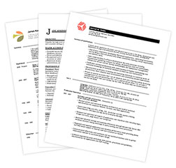
There are rules for resume writing that are pretty standard and widely accepted by professional resume writers and hiring managers. But what about resume format and style? Can employers really be so picky about appearance that they ignore how well-written and on target your experience and qualifications are?
Sure they can. But it should come as no surprise that style is a personal preference. While one employer may love your layout, the next may hate it. So what can you do about that?
Honestly, not much. But what you can do is make sure you've nailed the most basic style choices that will appeal to the widest possible range of hiring managers. You can put your own spin on colors and graphics, but components like font, margins, and indents should remain as basic as possible.
FONT
Typeface: The cleanest, clearest, and most popular font choices today are those without "feet," also known as sans-serif. Some examples of sans-serif typefaces are Verdana, Arial, Trebuchet, and Tahoma. On the other hand, very traditional employers might prefer a serif font such as Times New Roman, which resembles newspaper type.
Size: You have some flexibility here, but keep in mind that resume text should not fall below 9pts or exceed 12pts. For most fonts, it's better to stick with 10 or 11pts. Category headings can be a few points larger than the body text so they're easy to locate at a glance.
Style: Use bold or italics to make certain parts of your resume stand out. You might choose to italicize job titles or use bold or UPPERCASE lettering for category headings. But whatever you do, make sure you're consistent—if you italicize one job title, make sure to italicize them all! Also pay attention to punctuation (such as comma usage) and line spacing.
MARGINS
Combined with font size and style, margins contribute to the amount of white space on your resume, which is an important element for readability. Keep the margins between .5" and 1", making sure to set all four at the same size for consistency. Adjusting margins is also a great way to eliminate the problem of an unnecessary second page with just a line or two on it.
INDENTS
Indenting can be tricky if you're not familiar with tab settings. The most important thing to remember is to keep all indents aligned vertically down the page. If you indent your bullet lists, make sure all bullet lists have the same indent.
In the end, make all your layout and style choices in a way that lets the content of your resume stand out. Don't try to hide a poorly written resume under fancy text and over-the-top graphics, because hiring managers will notice. But on the other hand, don't be afraid to use a dash of color to make your resume stand out—just keep it clean and readable.
RELATED LINKS
Resume Writing Basics: Building Blocks of a Good Resume
How to Create a Generic, Useless, Well Written Resume
Plain Text Resumes: How to Make Them a Little Less Ugly
Ready To Jump Start Your Job Search?
